Why the banana?
The use of the Mami Wata banana logo has both a complex and straightforward story.
Simply put, the banana, like surfing in Africa, makes us smile. It reminds us of our Motherland and the gifts from nature itself that nourish and enriches our lives daily.
As a reminder, our brand takes its name and inspiration from the African sea spirit Mami Wata; the name means mother water. Those who believe in Mami Wata believe that if she takes you to be her lover in the ocean and survive, you'll come back better looking and more successful. It talks about the danger's and extraordinary transformative power of Africa's seas and oceans.
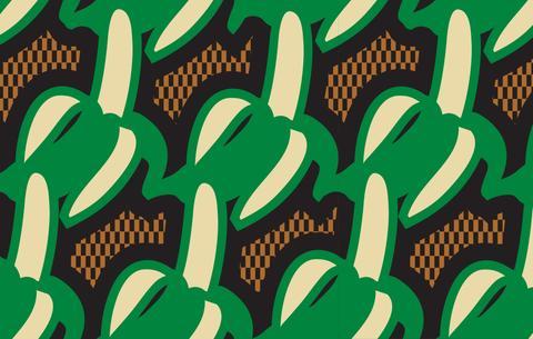
In the early days we first focussed on a logo with a literal representation of Mami Wata with a graphic design of the mermaid with the serpent, it’s a graphic we still use. Alongside this, we created a t-shirt with a banana graphic with our name on it. It quickly turned into a signature of ours. The banana was at a slightly provocative angle - we loved it, people loved it. Why? It's fun, sweet and playful!

At the same time we started at a pop-up market stand in Cape Town and decided to put a large banana on top of our stand. Scientists don't know why, but humans find it impossible not to experience a level of joy when they see oversized fruit. The large banana for us spoke to fun, albeit irreverent and abstract.

The long-form answer is a bit more considered and reflects the time we’ve spent with logo and discussions we have had about it.
Brands are always on a journey. They collect symbolism and meaning as they travel, becoming more refined through trial and experience. As a brand owner and creator, you hope that the logo becomes a shorthand for the positive associations you wanted people to have with the brand.
The banana is a symbol of our issue with the surf industry, which for us feels conservative, doesn't ask questions, and is exclusionary with its localism and 'kook culture'. The design of its products reflect this and doesn't ask more decisive questions about surfing, the surf industry and its role in the culture beyond it. Critically, the current industry's design language and brand stories don't relate to African surf culture and its relationship with the sea and diversity of those who live in and around it.
Yes, it's a bit fruity, depending on the angle, provocative. But that felt like what we want to do. To provoke and challenge an industry.


Our partners at the fantastic surf therapy organization Waves For Change describe their culture as "Bananas". For them, it symbolizes respect and truth.
Banana's yellow is a cheerful colour. The fruit has an association with hot tropical regions. The banana is ultimately democratic, and it's the same for everyone. It's the fruit of warm, tropic Africa.
The word 'banana' is thought to be of West African origin, from the Wolof word banaana, and passed into English via Spanish or Portuguese.
Fruit is a proven branding formula! With a bite out of it, an apple is a logo for the most valuable company in the world. Yes, a literal interpretation of their name, albeit with a bite out of it to allude to Adam taking a bite of the forbidden fruit (Here's to the crazy ones!). But it's still a bit of fruit.
From a graphic perspective, the banana design is simple, distinct and original.

We are aware of the ways the banana has been twisted and exploited through the years to represent racism towards black people. We use the banana as our tool against those views and a symbol that needs to be redefined and reclaimed.
As a company we take our mission seriously; we take the quality of products seriously and our view that Africa needs a new narrative seriously. We also take bananas seriously.
Look good. Do good. Surf good.


If you'd like any links to the history and origins of the word 'banana' that we referenced above and used when we first decorated it onto our tees, feel free to DM us, and we'll respond with them as fast as we can.


